Abbey Road Studios
Music and recording
UX, UI, Website optimisation
Optimising abbeyroad.com for a growing business
A site that had been overtaken by the business
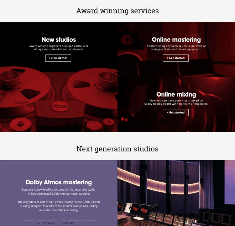
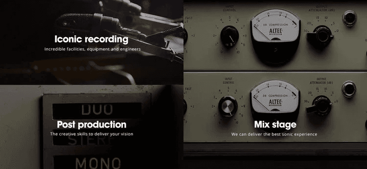
Abbeyroad.com launched in 2015 and had served the studio well, but the business had moved on. New studios, a new ATMOS mixing suite, updated online mastering and mixing pages. Two visual styles had started to creep across the site, the navigation was hiding content behind too many clicks, and the homepage had gone static on a brand with more going on than almost anywhere else in music. The brief was surgical, not a rebuild, but a set of targeted fixes to bring the site back up to the level of the studio behind it.
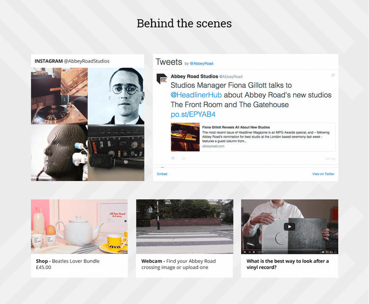
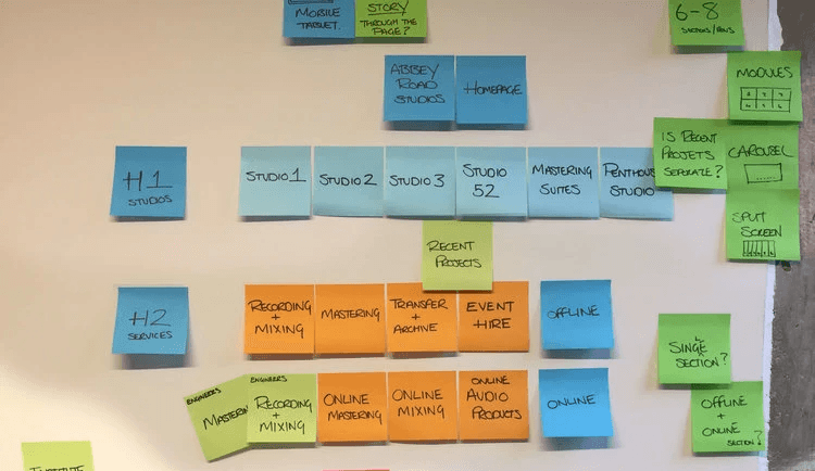
Navigation, homepage, news and the Live landing page
We redesigned the main navigation to be text-based, visible in one view, and faster to move through, no more scrolling to find a subcategory. The homepage was reworked to lead with the most interesting parts of the business rather than sit still. The news module was rebuilt to feel current, and the Live landing page was redesigned to showcase a part of the studio that deserved more than it was getting. Each piece went through research, concepting and refinement, with final PSDs handed to the in-house team for build.
A site that matches the studio behind it
The optimisations brought abbeyroad.com back into line with the business it represents. A clearer, faster navigation, a homepage that actually moves, and a visual consistency restored across the newer pages. Small, considered changes, in the right places, to keep one of the world's most iconic music brands looking the part online.